UI Component
Module Designer allows you to build 3 different types of components, Custom, List View, and Detail View components.You can navigate to Module Designer > Components to add the component you want.
Types Of Component :
- Custom Components: These are independent of the existing components in Vtiger CRM and can be reused across different custom pages and other custom components. If you are unfamiliar with what a component is, its importance, and its structure, please review the this document.
- List View Components: This component extends the main ListView component of Vtiger CRM, enabling you to add extra features to the existing ListView, according to your specific needs.
- Detail View Components: This component extends the main DetailView component of Vtiger CRM, enabling you to add extra features to the existing DetailView, according to your specific needs.
Note : While custom components are designed for reuse across various custom pages and other components, these changes won't automatically apply to the CRM interface. To see your customizations reflected in the CRM, you must add the custom component to Module Designer > TAP Scripts and then save and publish your changes. This step ensures that your modifications are integrated into the CRM's workflow and are visible in the interface.
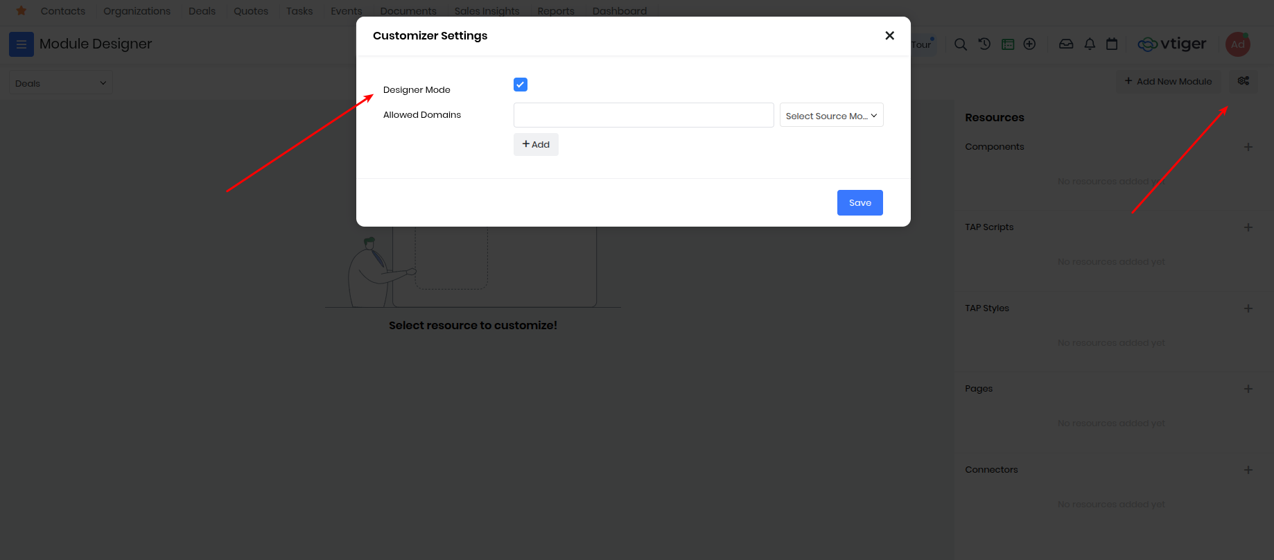
Enabling UI Components in Designer Mode
When "Designer mode" is enabled within the Module Designer's Customizer Settings, the "Add UI Component" feature becomes available. This allows for the creation and placement of:
- Global Actions
- List View Actions
- Detail View Actions
Custom Component
Custom Components are reuseable across multiple Custom Pages or other components built using TAP Scripts.
To add custom component, go to Module Designer and select any module and add Component under resources.
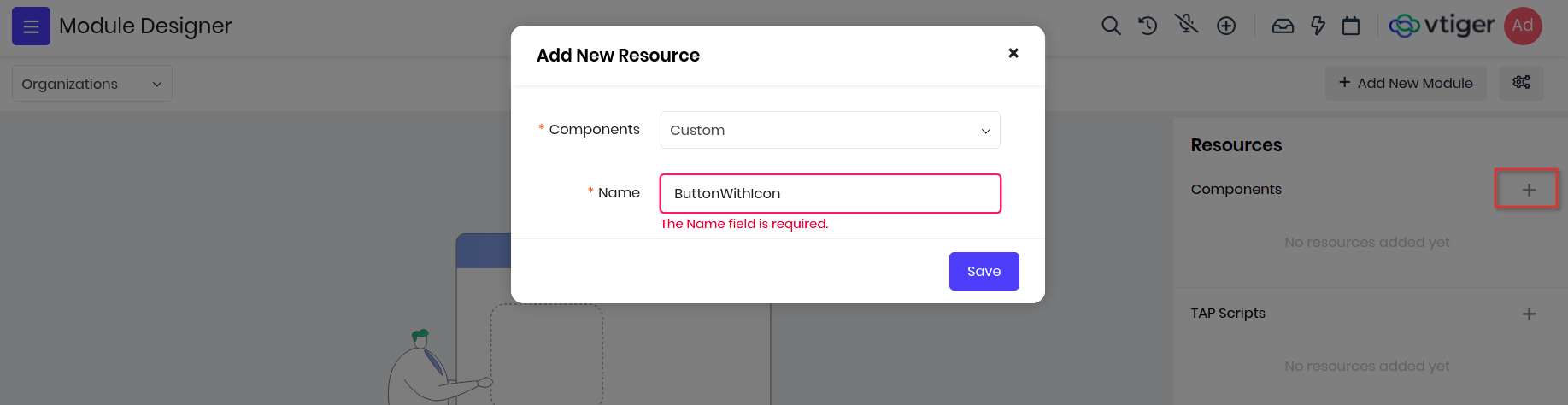
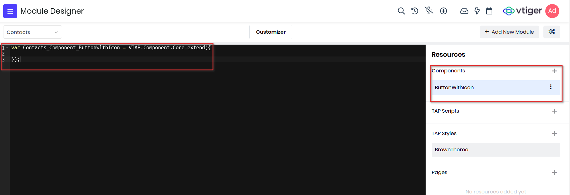
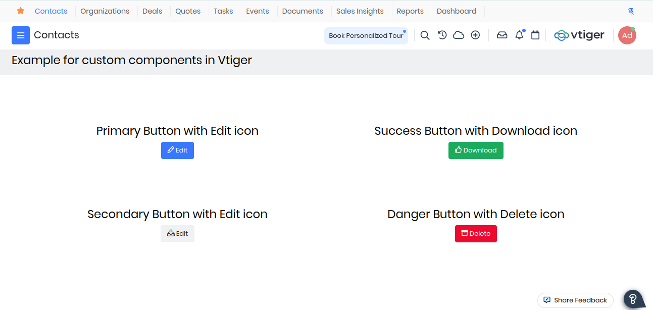
In the below example we will define a custom component that will show an icon inside the button. We will name it ButtonWithIcon and create it in Contacts module, you will see the IDE with default component name.
Example 1:
Lets start writing the component, first is the name of the component with "ButtonWithIcon". Since we want to add this in Contacts module, the final name would be Contacts_Component_ButtonWithIcon.
Note: Please be sure to follow the syntax for naming the component i.e ModuleName_Componet_Componentname, where Component is a standard keyword and ComponentName is the one that you provided while creating the component.
We want to give label to the button and pass an icon name to display before the label. These will be provided by the parent component as attributes so we need to add them in props properties. For icons we will make use of font awesome classes.
props : ["label", "icon"]
Finally we will add html which will be used to display in DOM to the template property. Notice the use of props in templates, if used to display as text then place them under curly braces, if passed to attribute then activate reactivity by binding with colon(:).
var Contacts_Component_ButtonWithIcon = VTAP.Component.Core.extend({

    //add props to get icon name and button label from parent component
    props : ['icon', 'label', 'varient'],

    //dynamic property defines button varient
    computed : {
        buttonClass() {
            if(this.varient == '') this.varient = 'primary';
            return 'btn btn-'+this.varient;
        }
    },

    //button html
    template :
        `<button :class="buttonClass">
            <i :class="icon"></i>
                {{label}}
            </button>`
});
See here on how the custom components are used in custom pages.
Example 2:
Lets create another component AdvancedSettings which would add a Custom Setting for the LIST_ADVANCED_SETTING hook present in the List View.
To know more about LIST_ADVANCED_SETTING hook please refer CRM Hooks.
var Contacts_Component_AdvancedSettings = VTAP.Component.Core.extend({

    created() {
        VTAP.Component.Register('LIST_ADVANCED_SETTING',
                                {name:'Custom Settings',
                                clickHandler:() => {
                                    alert('redirect to settings page');
                                }
                            });
    }
});
Example 3:
Lets create another component GlobalAction which would add an action fot the GLOBAL_ACTION hook present in the List View.
To know more about GLOBAL_ACTION hook please refer CRM Hooks.
var Contacts_Component_CustomGlobalIcon = VTAP.Component.Core.extend({
    methods : {
            click(){
                    alert('click on global action icon');
            }
    },
    template:`<ispan class='btn p-2' @click=click()><ii class='fa fa-cloud'><i/i><i/span>`
});
Click here to see how the CustomGlobalIcon component is used in another component built using TAP Scripts.
Save and Publish the component and it will be available for any custom page to include.
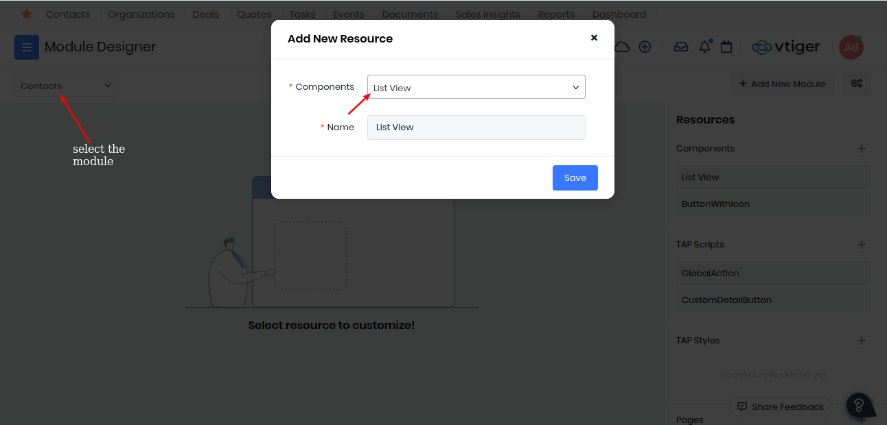
List View Component
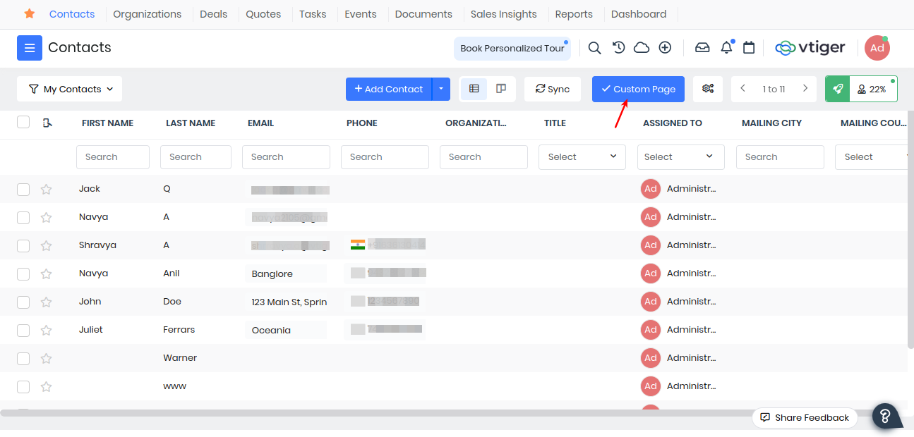
Consider a scenario where you have developed a custom page for the Contacts module, you’ll have to type the entire url every time you want to access the custom page, but using the list view component you can create a LIST_BASIC_BUTTON which on click will redirect you to the custompage.
Navigate Module Designer -> Select Module -> Component -> List View
Add the code for creating the button which redirects to the custom page on clicking
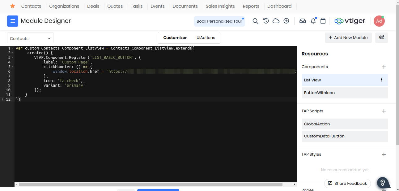
var custom_Contacts_Component_ListView = Contacts_Component_ListView.extend({
     created() {
        VTAP.Component.Register('LIST_BASIC_BUTTON', {
            label: 'Custom Page',
            clickHandler: () => {
                window.location.href = "https://vti-shrravya-a-20240721120901.od1.vtiger.ws/view/custompage?module=Contacts";
            },
            icon: 'fa-check',
            variant: 'primary'
        });
    }
});
Save And Publish. Now go back and refresh you should be able to see, the custom page button will be added to your List View of Contacts Module which onclick will redirect you to your custom page.
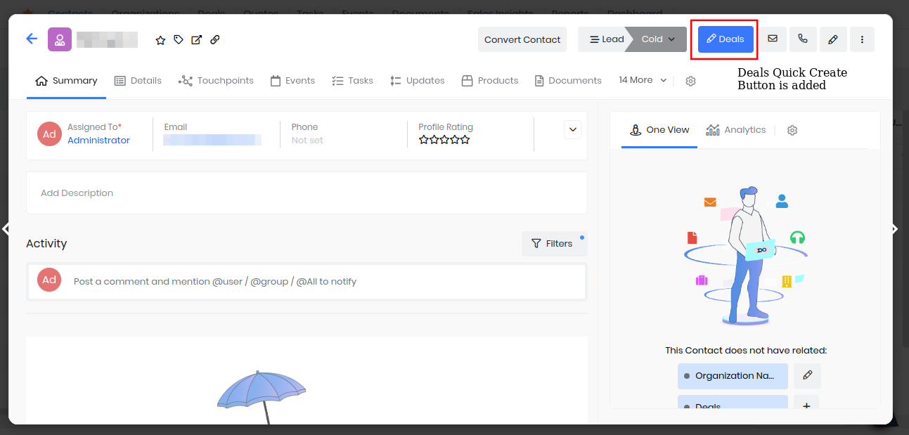
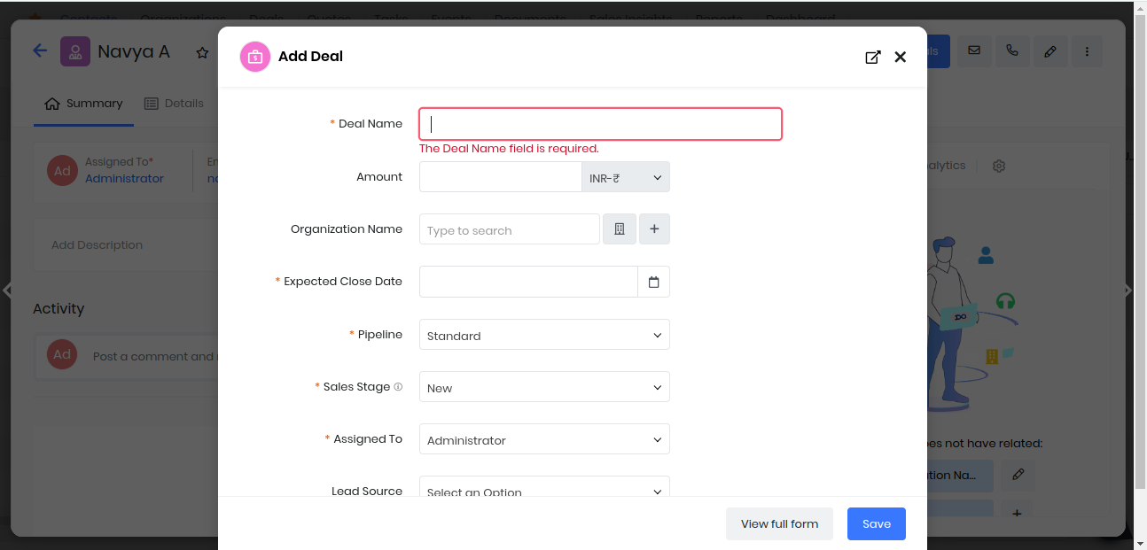
Detail View Component
Consider an example where you want to create a record for Deals in the Detail View of Contacts Module. We can add a button to the Detail View which on click will open the quick create of the Deals Module. Navigate Module Designer -> Select Module -> Component -> Detail View
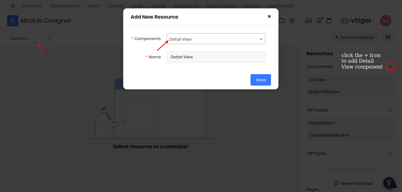
Add the code for creating a deals quick create button
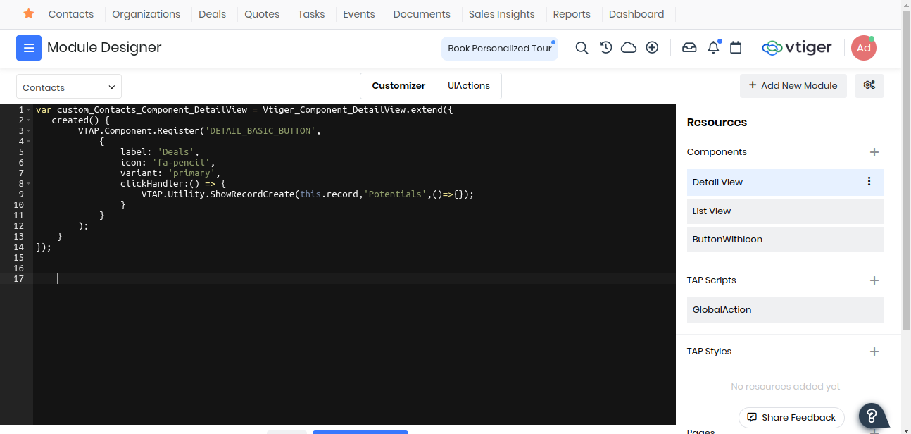
var custom_Contacts_Component_DetailView = Vtiger_Component_DetailView.extend({
   created() {
        VTAP.Component.Register('DETAIL_BASIC_BUTTON',
            {
                label: 'Deals',
                icon: 'fa-pencil',
                variant: 'primary',
                clickHandler:() => {
                    VTAP.Utility.ShowRecordCreate(this.record,'Potentials',()=>{});
                }
            }
        );
    }
});
Save And Publish. Now go back and refresh you should be able to see your Deals Quick Create Button in the detail view which on click will show a quick create of Deals.
TAP Scripts
TAP Scripts enables you to extend or customize the functionality of standard Vtiger CRM pages, such as ListView and DetailView by subscribing to the event hooks and reacting to the triggers at runtime etc.
This process integrates your customizations into the CRM's workflow, making them visible and functional in the user interface.
To use TAP Scripts got to Module Designer -> TAP Scripts -> Add
Enter the component name and the Module it has to effect. Now you will get a basic component structure where you can write your code for customizing or extending the CRM functionality.
Example 1 :
Lets use the Global Action component created in custom components and register a global action for the CRM.
var Contacts_Component_GlobalAction = VTAP.Component.Core.extend({
    created() {
        VTAP.Component.Register('GLOBAL_ACTION',
                                {},
                                VTAP.Component.Load('CustomGlobalIcon','Contacts'));
    }
});
After Save and publish go and refresh any page of the crm, a cloud icon will be added for the Global Actions hook, which on click will show the alert.
Example 2 :
Lets consider a stiuation where as soon as a Deals sales_stage is changed to "Closed Won" we want to update the related contacts status to "Cold". We can write a script which would do that.
Create a component lets say ContactStatus for Deals module through TAP Script of Module Designer. Now add the code.
var Potentials_Component_ContactStatus = VTAP.Component.Core.extend({
    data() {
        return {
            sales_stage : '',
            related_contactId : '',
            related_lastName : '',
            related_contactType : ''
         }
    },
    mounted() {
        VTAP.Event.Register('RECORD_UPDATED', (module, record) => {
            this.sales_stage = record.sales_stage;
            VTAP.Detail.RelatedRecords('Contacts', {}).then(
            (records) => {
                Object.values(records).forEach(({ id, lastname, contacttype }) => {
                this.related_contactId = id;
                this.related_lastName = lastname;
                this.related_contactType = contacttype;
                if(this.sales_stage == "Closed Won") {
                    this.updateContactStatus(this.related_contactId, this.related_lastName, this.related_contactType);
                }
                });
            });
        });
    },
    methods: {
        updateContactStatus(contact_id, lastname, contactType) {
            VTAP.Api.Post('records', {module : 'Contacts', id : contact_id, lastname : lastname, contacttype : contactType, contactstatus : 'Cold'}, (e,r) => {
                if(r) {
                VTAP.Utility.ShowSuccessNotification("Contacts status changed to Cold");
                } else {
                    VTAP.Utility.ShowErrorNotification(e);
                }
            })
        }
    }
});
Save and publish the TAP Script. Go to any Deals record which has related contacts and update its sales_stage to "Closed Won". After the sales stage is updated you will get a success notification telling "Contacts status changed to cold". You can go check those contacts records their status would be changed to "Cold".
You can also checkout this example on how to add a custom button in the List Page using TAP Script.