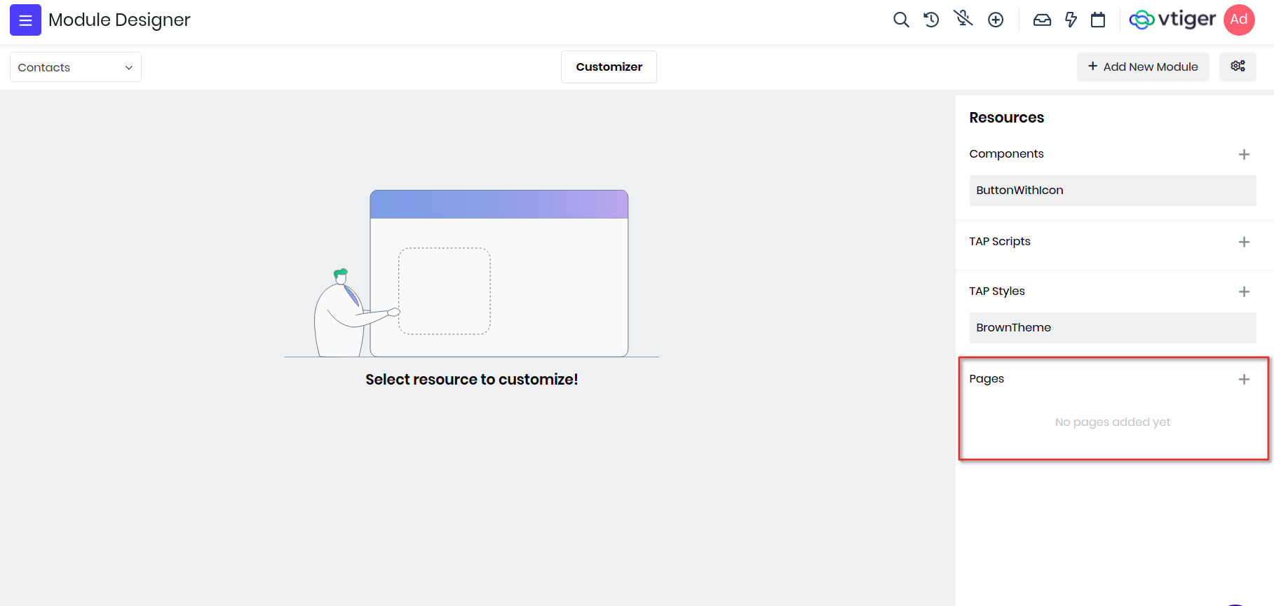
Pages
VTAP gives you the ability to build custom pages from scratch, where you can display forms, lists, charts, widgets etc for any existing modules or custom modules. To create a new page go to Platform > Module Designer > Select module > Pages
Example : We will create a custom page and include custom component ButtonWithIcon we added in the previous section.
In Vtiger, components are the building blocks for any pages, widgets, charts, lists etc. So when a new page is created, by default page component is added and shown in IDE.
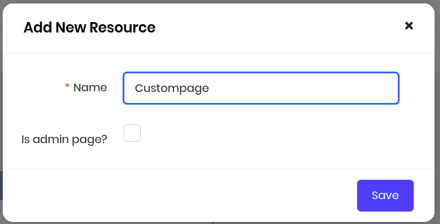
Lets create one page with name "Custompage" and save it. You will see a checkbox "Is admin page?", tick this if you want to create page for admin users only, this is generally used when you want to admins to configure for a feature or store login credentials to connect to any external apps.
To add a custom component you will use components property of the vue instance and load it by passing the name and module of the component where its defined. Then use the component button_icon in the template and pass appropriate details like icon and label as attributes.
var Contacts_Component_CustompageView = VTAP.Component.Core.extend({

    components : {
        'button_icon' : VTAP.Component.Load('ButtonWithIcon','Contacts')
    },

    template :
        `<div class="vds-body">
                <div class="vds-bodyfixedheader container-fluid py-2 px-0 bg-grey-hue-8 px-4">
                    <h3>Example for custom components in Vtiger</h3>
                </div>
                <div class="vds-bodycontents px-4 m-5">
                    <div class='row'>
                        <div class='d-flex flex-column col-6 p-5'>
                            <div class='d-flex justify-content-center'>
                                <h3>Primary Button with Edit icon<h3>
                            </div>
                            <div class="d-flex justify-content-center">
                                <button_icon icon="fa fa-pencil" label="Edit" varient="primary"></button_icon>
                            </div>
                        </div>
                    </div>
                </div>
            </div>`
});
Lets add more buttons with different varient and icons.
var Contacts_Component_CustompageView = VTAP.Component.Core.extend({

    components : {
        'button_icon' : VTAP.Component.Load('ButtonWithIcon','Contacts')
    },

    template :
            `<div class="vds-body">
                    <div class="vds-bodyfixedheader container-fluid py-2 px-0 bg-grey-hue-8 px-4">
                        <h3>Example for custom components in Vtiger</h3>
                    </div>
                    <div class="vds-bodycontents px-4 m-5">
                        <div class='row'>
                            <div class='d-flex flex-column col-6 p-5'>
                                <div class='d-flex justify-content-center'>
                                    <h3>Primary Button with Edit icon</h3>
                                </div>
                                <div class='d-flex justify-content-center'>
                                    <button_icon icon="fa fa-pencil" label="Edit" varient="primary"></button_icon>
                                </div>
                            </div>

                            <div class='d-flex flex-column col-6 p-5'>
                                <div class='d-flex justify-content-center'>
                                    <h3>Success Button with Download icon</h3>
                                </div>
                                <div class='d-flex justify-content-center'>
                                    <button_icon icon="fa fa-thumbs-up" label="Download" varient="success"></button_icon>
                                </div>
                            </div>
                        </div>

                        <div class='row'>
                            <div class='d-flex flex-column col-6 p-5'>
                                <div class='d-flex justify-content-center'>
                                    <h3>Secondary Button with Edit icon</h3>
                                </div>
                                <div class='d-flex justify-content-center'>
                                    <button_icon icon="fa fa-download" label="Edit" varient="secondary"></button_icon>
                                </div>
                            </div>

                            <div class='d-flex flex-column col-6 p-5'>
                                <div class='d-flex justify-content-center'>
                                    <h3>Danger Button with Delete icon</h3>
                                </div>
                                <div class='d-flex justify-content-center'>
                                    <button_icon icon="fa fa-archive" label="Delete" varient="danger"></button_icon>
                                </div>
                            </div>
                        </div>
                    </div>
                </div>`
});
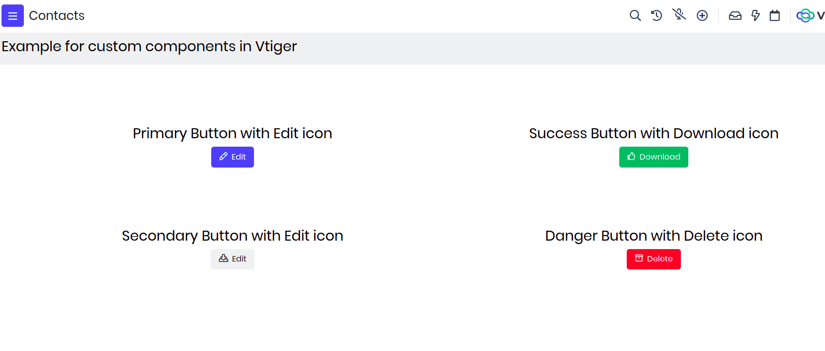
The final page would look like below screen shot.
How to access Custom Page?
Any Custom page can be accessed with a URL. URL format is like below
$YOUR_INSTANCE_URL/view/$PAGE_NAME?module=$MODULE_NAME
$PAGE_NAME = Name of the page given while adding the page (all small letters) $MODULE_NAME = Name of the module in which page is added
Example : https://acme.odx.vtiger.com/view/Custompage?module=Contacts
If you are building admin page then the URL will change to https://acme.odx.vtiger.com/admin/view/Custompage?module=Contacts