CRM Look & Feel
You can change the look and feel of the CRM, change the color of the buttons, increase/decrease the font size, change the size of default icons etc. To change these styles in Vtiger you need to be familiar with css.
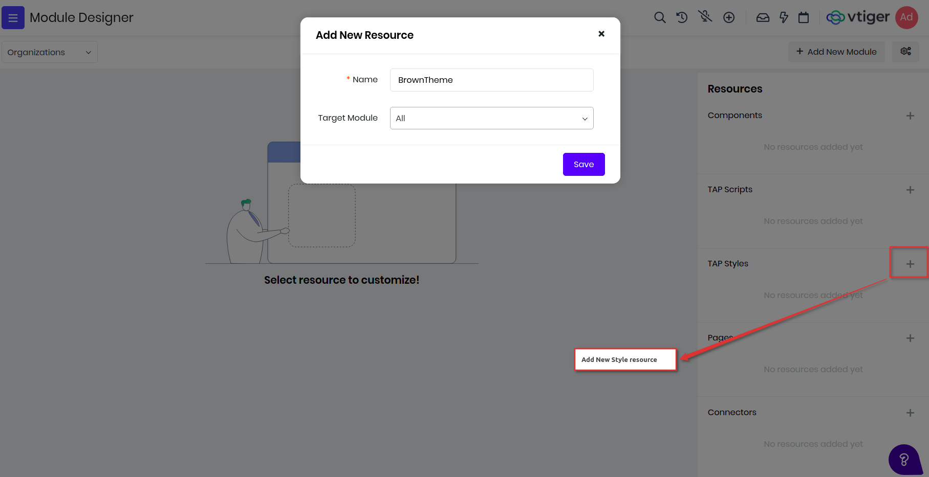
(i) Go to Module Designer and create new TAP Style by providing it with a name and optional module. In the example below lets build a new theme for Vtiger, let me call it a BrownTheme and apply for all the module.
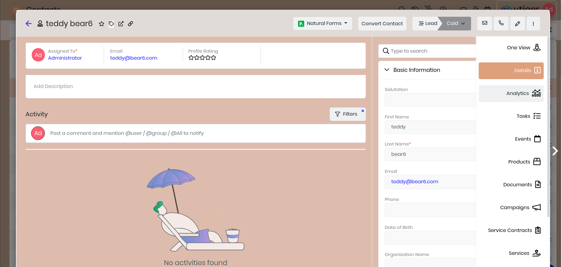
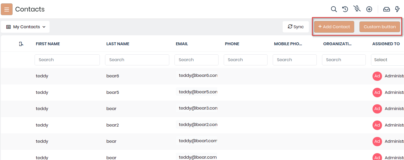
(ii) Add the below styles for changing the primary button colors, we use bootstrap framework for layout. Save and publish to reflect the changes, go to Contacts page and refresh it see it in action.
.btn-primary, .btn-primary:active {
    background-color : #d2a07b !important;
    border : 1px solid #a99e90 !important;
}
(iii) To change the top header, body header and body content changing the background colors, like below. Save and Publish and refresh to see the changes.
#topbar {
    background-color : #c0a793 !important;
}
.vds-body, .vds-bodyfixedheader {
    background-color : #f5e6df !important;
}
.vds-bodycontents {
    background-color : #c0a793 !important;
}
(iv) Like wise we have added more changes in to reflect brown theme are different parts of the product. Below have added css content of the BrownTheme styles. Though this is not 100% ready but it is still give you an idea on how you can build more such themes.
.btn-primary, .btn-primary:active {
    background-color : #d2a07b !important;
    border : 1px solid #a99e90 !important;
}
button.btn-primary:hover, .bg-primary-active,
    .filterTypes .filterTypesContainer:hover,
    .btn-primary:not(:disabled):not(.disabled).active,
    .btn-primary:not(:disabled):not(.disabled):active {
        background-color : #c1a692 !important;
        border : 1px solid #a99e90 !important;
}
.border-primary {
    border-color : #c1a692 !important;
}
.active-shadow {
    box-shadow : 0 0 0 0.08rem rgb(210,160,123) !important;
}
#topbar {
    background-color : #c0a793 !important;
}
.vds-body, .vds-bodyfixedheader {
    background-color : #f5e6df !important;
}
.vds-bodycontents {
    background-color : #c0a793 !important;
}
#listview-table .resize-body tr:hover:not(.selectedRow) td, .selectedRow td {
    background-color : #ffd9c4 !important;
}
#detailHeader {
    background-color : #e0dbd7 !important;
}
.detailBody, .bg-grey-hue-7 {
    background-color : #d6bcae !important;
}
.vt-checkbox-container input:checked ~.roundedCheckmark:not(.filter-checkmark),
    .select2-container--default .select2-results__option--highlighted[aria-selected],
    .bg-blue-5 {
    background-color : #d2a07b !important;
}
.activeApp, .blockSideLabel.active {
    border-left : 4px solid #c1a692;
}
.form-control:focus {
    border-color : #c1a692 !important;
    box-shadow : 0 0 0 0.08rem rgb(210,160,123) !important;
}
.blockSideLabel.active,
.dropdown-item:focus,
.dropdown-item:hover,
.listViewFilters .dropdown-item:hover{
    background-color : #f5e6df !important;
}
Final screens would like: