UI Actions
The ui components feature enables us to modify or add custom buttons or icons. Which on click will perform actions.
Adding a component
- VTAP has enabled new low code platform where you can just perform actions by writing onclick functions.
- Click on the green box on top of the page. ref
- Now you can see a popup. By adding the following details we can get started on ui components.
- component name -> the name of the component which you want to use for this custom action.
- component type ->What type if component it is. (Where this icon will sart showing in the UI).
- module -> to whcih module it should show and work.
- on clcik -> what is the action to be performed when this button is clicked.
- button label -> name of the button to show
- component icon -> the icon can be selected from the pre defined drop down.
- color -> color of the button or the icon.
Different Component Types :
- Detail View Basic Button
- Detail View Action Icon
- Detail View More Action Item
- Detail More Action Activity Item
- Detail One View Widget
- Detail Header Widget
- Detail Summary Widget
- Detail Related Record Action
- List View Basic Button
- List Mass Action
- List Advance Settings (only for Admin users)
- List Custom Views (Kanban view, Calendar view, or List of records view)
- List Row Basic Action
- List Row Secondary Action
- Global Action
Note :
Component types are nothing but crm hooks i.e specific points in the UI. To understand more about them please refer CRM Hooks
And to understand what each component type describes and its examples please refer Component Types
Examples
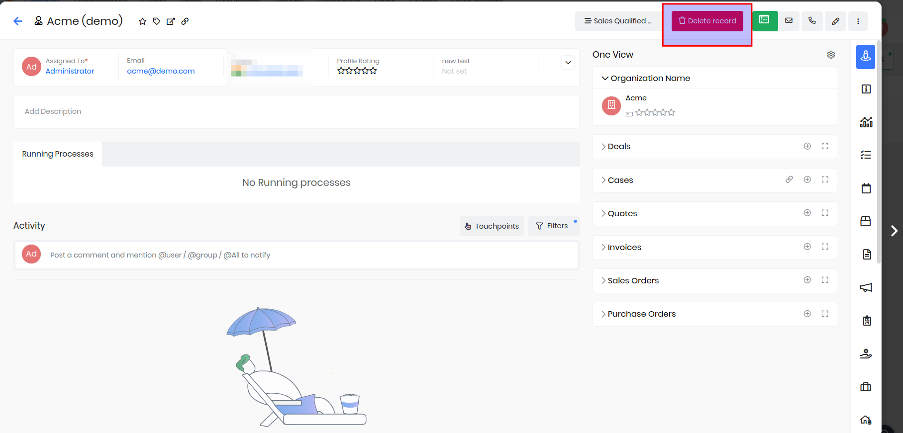
Detail View Basic Button - Add a button to delete the current record from header view.
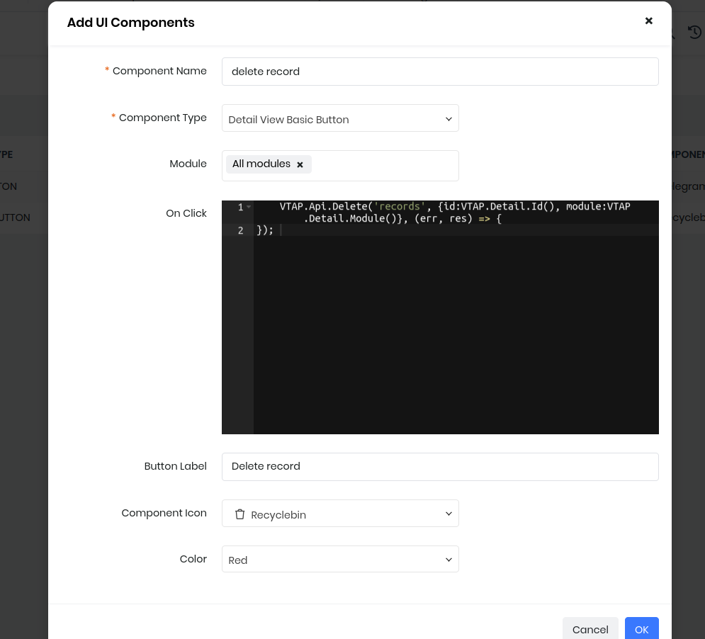
VTAP.Api.Delete('records', {id:VTAP.Detail.Id(), module:VTAP.Detail.Module()}, (err, res) => {
});
- First go to ui actions and create a new record.
- Add module as contacts.
- choose the name of the button and icon.
- now go to on click block.
- Add the above code. Here we will take the record id by using VTAP.Detail.Id() and similarliy for module.
- You can add a notification on sucess to show the record is deleted.
List View Basic Button - Add a button to redirect to custom page.
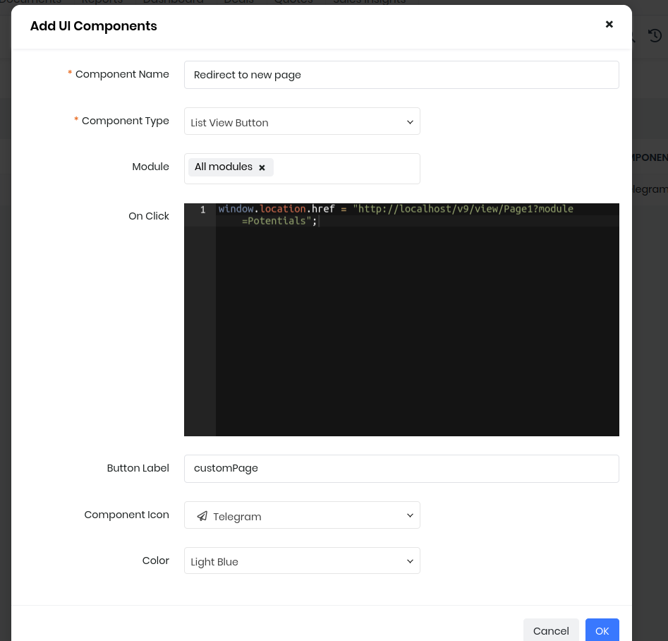
window.location.href = "https://xxxxx.od2.vtiger.com/view/Page1?module=Potentials";
- Go to Ui actions create a new actions.
- Add any component name which suits your action.
- Select the modules.
- Select the button label and the icon.
- Select color.
- Now add the above code in onclick block.
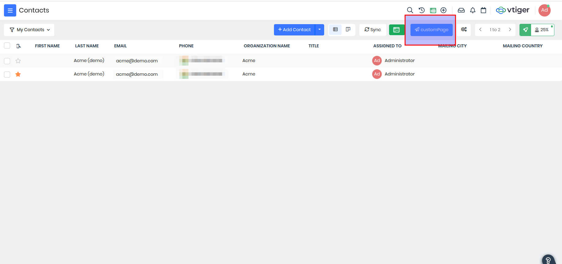
- On clciking that button from list view you will be redirected to the custom page or any website which is added.
Example 2 - Create a POPUP Modal using module designer and UI actions.
- First lets add the trigger which will open the popup, for example add a button in List page. You need to go to UI Actions inside Platforms > Module Designer.
- Add UI Component and select Component Type as "List View Button".
- Give a Label, icon, color if needed and then in On click you need to add below code.
// Popup is the name of the popup component defined in Contacts module
VTAP.Utility.ShowPopup({component:VTAP.Component.Load('Popup','Contacts')});
- Go to module designer select Contacts module to create a popup component.
- Click on components and create a component by selecting custom in the options with name. ex- Popup.
- Add the below code in the module designer.
- Here MYMODULE should be replaced by the current module name(eg:Contacts) where the tap script is created.
- Save and publish the script to see the popup in action.
    var MYMODULE_Component_Popup = VTAP.Component.Core.extend({
        data() {
        //store popup data to make use of them to display and to send it to server
        return {
            name:"",
            email:""
        }
    },
    methods: {
        onok(event) {
            //prevent popup to close
            event.preventDefault();

             //add post action on click on ok button
            VTAP.Api.Post("records", {module:'Contacts',"lastname":this.name,"email":this.email}, (error,response) => {
                    if(response) {
                        VTAP.Utility.ShowSuccessNotification("Saved successfully");
                        this.hidePopup();
                    } else {
                        VTAP.Utility.ShowErrorNotification(error);
                    }
             });
        },
        hidePopup() {
            //bv::hide::modal is the event, modal-1 is the modal popup id which needs to be closed.
            this.$root.$emit('bv::hide::modal', 'modal-1')
        }
    },
    //:no-close-on-backdrop="true" is to ensure the popup is not closed when clicked outside the modal
    template: `<b-modal  id="modal-1" title="Save Contact" @ok=onok  ok-title="Save" :no-close-on-backdrop="true">
                    <p class="my-4">
                        <div class="container" >
                             <input v-model="name" class="form-control w-50 m-2" placeholder="Enter the name">
                             <input v-model="email" class="form-control w-50 m-2" placeholder="Enter the email address">
                        </div>
                    </p>
                </b-modal>`
});